Smart TV user experience design sharing focus
Two years ago, as a newcomer to the TV UI, I found that there were very few interactive and UI tutorials about TV, and there were very few related articles. Two years have passed, and the search for a smart TV UI on the major design websites is still a little bit of a pitiful thing. All the big brothers and sisters who are doing TV, are you so sorry for your pen? Can you write a tutorial to teach you how to get new meat? Ok, no nonsense, now I am no longer a little fresh meat, I just want to record what I have learned in the past two years. If I am seen by some fresh meat that I want to enter the TV UI, I hope. Can help.
This article first talks about the first element of the TV user experience: focus, the program is called Focus.
The mobile page has clickable content and non-clickable content. Correspondingly, on the TV, we have "available focus content" and "not available focus content". (Generally, the content on the TV is available for focus, only some of the prompt text has no focus attribute.) First look at the two images.
This is the homepage of the famous Dangbei market in the TV circle, the top label focus and the content focus style, which is also the style of most current TV-end App focus. This focus is simple, beautiful and eye-catching.
Let's talk about the first issue to be aware of in the TV focus visual design: Where is the focus?
Design principle: the focus should be eye-catching
Suggested method: Use strokes, outer glows, zooms in, or other animations to enhance focus visuals. Of course, the more exaggerated the better, the more appropriate, the best.
The focus on the TV screen is also the user's visual point of landing. The user's feeling of finding a full screen and not knowing where he is is very crashing. I don't know where the focus is, I can't predict what happens when I press the remote. Let's look at a picture with a very weak focus:
Since Xiaomi first used the fashion pictorial as a screen saver on TV, a batch of screen saver image TV apps appeared. The above picture shows a first time use setting interface for an app called style. Left, dark and light buttons, which is the focus? Suppose the focus is on "skip", but the user thinks that the focus is all-selection. If you press the remote control to skip this interface, the user will be very surprised. "Hey, what did I press!?" If the next page does not support Returning to re-editing, the user will be very crashing. The focus of this app is not very obvious, look at the right picture, there is no magnification and no external illumination and no dynamic assistance, but fortunately, it can still be distinguished.
The second question to be aware of: Should the style of the focus be unified?
Design principle: the style is as uniform as possible, so that it feels like a family~
Suggested method: Focus on the outer light box, replace the color focus and try not to mix it. Do not have a lot of animation styles in the focus of the animation, try to be unified.
Looking at the above picture, the color block card is currently the most popular form of TV UI. If the focus style is also a color block, it will inevitably cause visual confusion. I will give another example in the following figure.
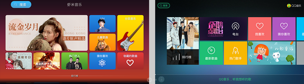
Shrimp music search button focus style, and QQ music search button focus style, which is more straightforward? Obviously it is QQ music, it seems that the focus of the Goose Factory on the TV App has also been studied, haha. In addition, I would like to talk about the focus of a page in the Internet TV rookie storm TV.
Did you find the focus? That's right, the focus is on the "unsigned" in the lower left corner. This is an animated effect. The storm TV's UI uses a lot of soft micro animations to create a nice atmosphere. Xiaomi TV UI also has a lot of animations in place, LeTV will not mention, LeTV just came out very beautiful in that era, but in the past few years there is no design innovation, I feel that its UI has been abandoned by the times.
Qunsuo are dedicated in Industrial PDA, our PDAs are durable and long time standby. We can provide handheld Barcode Scanner Pda, PDA with built in printer and so on. All of our PDA provide with demo app and free SDK, supporting our customers for use easily. We can provide our customers prompt after-sales service about any technical supports. Our PDA support many functions, including RFID reader, NFC reader, Barcode Scanner, UHF reader, fingerprint scanner, IC card reader, PSAM and etc. And also if you have any PDA OEM/ODM requirements, we can also help you to make prototype into physical.

Industrial PDA
Barcode Scanner Pda,Pda Scanner Android,Pda Printer Scanner,Pda Android 2D Barcode Scanner
Shenzhen Qunsuo Technology Co., Ltd , https://www.qsprinter.com